css3绘制几何图形的例子
作者:袖梨
2022-06-25
1、圆形
示例: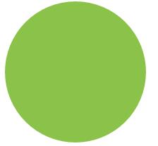
思路给任何正方形元素设置一个足够大的 border-radius 就可以把它变成一个圆形.代码如下
html:
css:
.size{


    background: #8BC34A;
}
.example1{
    border-radius:100px;
}
2、自适应椭圆
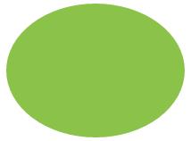
思路border-radius 这个属性还有另外一个鲜为人知的真相它不仅可以接受长度值还可以接受百分比值。这个百分比值会基于元素的尺寸进行解析.这意味着相同的百分比可能会计算出不同的水平和垂直半径。代码如下
html:
css:
.example3{


    border-radius:50%;
    background: #8BC34A;
}
3、自适应的半椭圆:沿横轴劈开的半椭圆
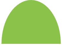
思路border-radius 的语法比我们想像中灵活得多。你可能会惊讶地发现 border-radius 原来是一个简写属性。第一种方法就是使用它所对应的各个展开式属性
- border-top-left-radius
- border-top-right-radius
- border-bottom-right-radius
- border-bottom-left-radius
我们甚至可以为所有四个角提供完全不同的水平和垂直半径方法是在斜杠前指定 1~4 个值在斜杠后指定另外 1~4 个值。举例来说当 border-radius 的值为10px / 5px 20px 时其效果相当于 10px 10px 10px 10px / 5px 20px 5px 20px 。
为 border-radius 属性分别指定4、3、2、1 个由空格分隔的值时这些值是以这样的规律分配到四个角上的请注意对椭圆半径来说斜杠前和斜杠后最多可以各有四个参数这两组值是以同样的方法分配到各个角的
代码如下自适应的半椭圆:沿横轴劈开的半椭圆
html:
css:
.example4{


    border-radius: 50% / 100% 100% 0 0;
    background: #8BC34A;
}
4、自适应的半椭圆:沿纵轴劈开的半椭圆
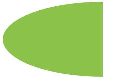
思路自适应的半椭圆:沿纵轴劈开的半椭圆
代码如下
html:
css:
.example5{


    border-radius: 100% 0 0 100% / 50%;
    background: #8BC34A;
}
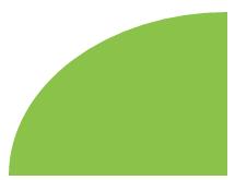
5、四分之一椭圆
思路其中一个角的水平和垂直半径值都需要是100%而其他三个角都不能设为圆角。
代码如下
html:
css:
.example6{


    border-radius: 100% 0 0 0;
    background: #8BC34A;
}
6、用椭圆绘制opera浏览器的logo
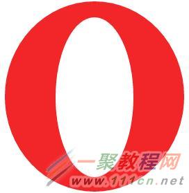
思路绘制opera浏览器的logo,分析起来不难就只有两个图层一个是最底部的椭圆一个是最上面那层的椭圆。先确定一下最底层的椭圆宽高量了一下水平宽度为258px垂直高度为275px因为其是一个对称的椭圆没有倾斜度故4个角均为水平半径为258px垂直半径为275px的4个相等椭圆用同样的办法确定最里面的椭圆的半径因此四个角均为水平半径120px垂直半径为229px的椭圆代码如下
html:
css:
.opera{


    background: #F22629;
    border-radius:258px 258px 258px 258px /275px 275px 275px 275px;
    position: relative;
}
.opera-top{


    background: #FFFFFF;
    border-radius: 112px 112px 112px 112px/231px 231px 231px 231px;
    position: absolute;
    left: 50%;
    right: 50%;
    top: 50%;
    bottom: 50%;
    margin-left: -56px;
    margin-top: -115px;
}
7、平行四边形
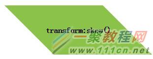
思路伪元素方案:是把所有样式背景、边框等应用到伪元素上然后再对 伪元素进行变形。因为我们的内容并不是包含在伪元素里的所以内容并不会受到变形的影响。代码如下
html:
css:
.button {


    position: relative;
    left: 100px;
    line-
    text-align: center;
    font-weight: bolder;
}
.button::before {
content: ''; /* 用伪元素来生成一个矩形 */
position: absolute;
top: 0; right: 0; bottom: 0; left: 0;
z-index: -1;
transform: skew(45deg);
background: #8BC34A;
}
content: ''; /* 用伪元素来生成一个矩形 */
position: absolute;
top: 0; right: 0; bottom: 0; left: 0;
z-index: -1;
transform: skew(45deg);
background: #8BC34A;
}
技巧总结这个技巧不仅对 skew() 变形来说很有用还适用于其他任何变形样式当我们想变形一个元素而不想变形它的内容时就可以用到它。
8、菱形
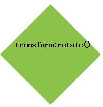
思路我们把这个技巧针对 rotate() 变形样式稍稍调整一下再用到一个正方形元素上就可以很容易地得到一个菱形。代码如下
html:
transform:rotate()
css:
.example1 {


    position: relative;
    left: 100px;
    line-
    text-align: center;
    font-weight: bolder;
}
.example1::before {
    content: '';
    position: absolute;
    top: 0; right: 0; bottom: 0; left: 0;
    z-index: -1;
    transform: rotate(45deg);
    background: #8BC34A;
}
技巧总结这个技巧的关键在于我们利用伪元素以及定位属性产生了一个方块 然后对伪元素设置样式并将其放置在其宿主元素的下层。这种思路同样可 以运用在其他场景中从而得到各种各样的效果。
9、菱形图片
思路基于变形的方案
我们想让图片的宽度与容器的对角线相等而不是与边长相等。需要用到勾股定理这个定理告诉我们一个正方形的对角线长度等于它的边长乘以根号2约等于1.414 213 562 。因此把 max-width 的值设置为根号2乘以100%约等于 414.421 356 2% 是很合理的或者把这个值向上取整为 142% 因为我们不希望因为计算的舍入问题导致图片在实际显示时稍小但稍大是没问题的反正我们都是在裁切图片嘛
我们想让图片的宽度与容器的对角线相等而不是与边长相等。需要用到勾股定理这个定理告诉我们一个正方形的对角线长度等于它的边长乘以根号2约等于1.414 213 562 。因此把 max-width 的值设置为根号2乘以100%约等于 414.421 356 2% 是很合理的或者把这个值向上取整为 142% 因为我们不希望因为计算的舍入问题导致图片在实际显示时稍小但稍大是没问题的反正我们都是在裁切图片嘛
代码如下
html:

css:
.picture {

    transform: rotate(45deg);
    overflow: hidden;
    margin: 50px;
}
.picture img {
    max-width: 100%;
    transform: rotate(-45deg) scale(1.42);
    z-index: -1;
    position: relative;
}
技巧总结我们希望图片的尺寸属性保留 100% 这个值这样当浏览器不支持变 形样式时仍然可以得到一个合理的布局。 通过 scale() 变形样式来缩放图片时是以它的中心点进行缩放的 除非我们额外指定了 transform-origin 样式 。通过 width 属性 来放大图片时只会以它的左上角为原点进行缩放从而迫使我们 动用额外的负外边距来把图片的位置调整回来.
10、切角效果
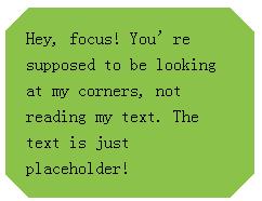
思路基于background:linear-gradient()的方案:把四个角都做出切角效果了。你需要四层渐变图案代码如 下所示
html:
Hey, focus! You’re supposed to be looking at my corners, not reading my text. The text is just placeholder!
css:
.example2{
    background: #8BC34A;
    background: linear-gradient(135deg, transparent 15px, #8BC34A 0) top left,
                linear-gradient(-135deg, transparent 15px, #8BC34A 0) top right,
                linear-gradient(-45deg, transparent 15px, #8BC34A 0) bottom right,
                linear-gradient(45deg, transparent 15px, #8BC34A 0) bottom left;
    background-size: 50% 50%;
    background-repeat: no-repeat;

    padding: 1em 1.2em;
    max-width: 12em;
    line-height: 1.5em;
}
11、弧形切角
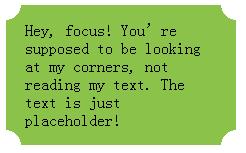
思路上述渐变技巧还有一个变种可以用来创建弧形切角很多人也把这种 效果称为“内凹圆角” 因为它看起来就像是圆角的反向版本 。唯一的区别 在于我们会用径向渐变来替代上述线性渐变代码如下
html:
Hey, focus! You’re supposed to be looking at my corners, not reading my text. The text is just placeholder!
css:
.example3{
    background: #8BC34A;
    background: radial-gradient(circle at top left, transparent 15px, #8BC34A 0) top left,
                radial-gradient(circle at top right, transparent 15px, #8BC34A 0) top right,
                radial-gradient(circle at bottom right, transparent 15px, #8BC34A 0) bottom right,
                radial-gradient(circle at bottom left, transparent 15px, #8BC34A 0) bottom left;
    background-size: 50% 50%;
    background-repeat: no-repeat;

    padding: 1em 1.2em;
    max-width: 12em;
}
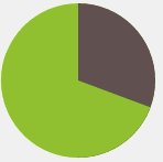
12、简单的饼图
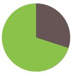
思路基于 transform 的解决方案我们现在可以通过一个 rotate() 变形属性来让这个伪元素转起来。 如果我们要显示出 20% 的比率我们可以指定旋转的值为 72deg 0.2 × 360 = 72 写成 .2turn 会更加直观一些。你还可以看到其 他一些旋转值的情况。代码如下
html:
css
.pie{


    background: #8BC34A;
    border-radius: 50%;
    background-image: linear-gradient(to right,transparent 50%,#655 0);
}
.pie::before{
    content: '';
    display: block;
    margin-left: 50%;
    height: 100%;
    border-radius: 0 100% 100% 0 / 50%;
    background-color: inherit;
    transform-origin: left;
    transform: rotate(.1turn);/*10%*/
    transform: rotate(.2turn);/*20%*/
    transform: rotate(.3turn);/*30%*/
}
提示在参数中规定角度。turn是圈1turn = 360deg另外还有弧度rad2nrad = 1turn = 360deg。如transform:rotate(2turn); //旋转两圈
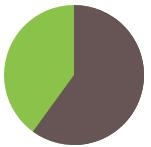
此方法显示 0 到 50% 的比率时运作良好但如果我们尝试显示 60% 的比率时比如指定旋转值为 .6turn 时会出现问题。解决方法使 用上述技巧的一个反向版本来实现这个范围内的比率设置一个棕色的伪 元素让它在 0 至 .5turn 的范围内旋转。因此要得到一个 60% 比率的饼 图伪元素的代码可能是这样的
html:
css:
.pie2{


    background: #8BC34A;
    border-radius: 50%;
    background-image: linear-gradient(to right,transparent 50%,#655 0);
}
.pie2::before{
    content: '';
    display: block;
    margin-left: 50%;
    height: 100%;
    border-radius: 0 100% 100% 0 / 50%;
    background: #655;/*当范围大于50%时,需要改变伪元素的背景颜色为#655;*/
    transform-origin: left;
    transform: rotate(.1turn);
}
用 CSS 动画来实现一个饼图从 0 变化到 100% 的动画从而得到一个炫酷的进度指示器
代码如下
html:
css:
.pie3 {


    border-radius: 50%;
    background: yellowgreen;
    background-image: linear-gradient(to right, transparent 50%, currentColor 0);
    color: #655;
}

.pie3::before {
    content: '';
    display: block;
    margin-left: 50%;
    height: 100%;
    border-radius: 0 100% 100% 0 / 50%;
    background-color: inherit;
    transform-origin: left;
    animation: spin 3s linear infinite, bg 6s step-end infinite;
}

@keyframes spin {
    to { transform: rotate(.5turn); }
}
@keyframes bg {
    50% { background: currentColor; }
}