CSS3如何实现雷达扫描图 CSS3实现雷达扫描图代码示例
作者:袖梨
2022-06-25
CSS3如何实现雷达扫描图?本篇文章小编给大家分享一下CSS3实现雷达扫描图代码示例,文章代码介绍的很详细,小编觉得挺不错的,现在分享给大家供大家参考,有需要的小伙伴们可以来看看。
通过css3实现炫酷的雷达扫描图:
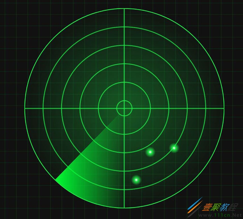
代码如下:
// index.html


    雷达扫描图
//index.css
* {
    box-sizing: border-box;
}

html {
    height: 100%;
    background-color: #111;
    font-size: 10px;
}


body {
    background-image:
        linear-gradient(0deg, transparent 24%, rgba(32, 255, 77, 0.15) 26%, transparent 27%, transparent 74%, rgba(32, 255, 77, 0.15) 76%, transparent 77%, transparent),
        linear-gradient(90deg, transparent 24%, rgba(32, 255, 77, 0.15) 26%, transparent 27%, transparent 74%, rgba(32, 255, 77, 0.15) 76%, transparent 77%, transparent);
    background-size: 8rem 8rem;
    width: 100%;
    height: 100%;
    position: relative;
    padding: 0;
    margin: 0;
    font-size: 1.6rem;
}

.radar {
    background:
        -webkit-radial-gradient(center, rgba(32, 255, 77, 0.3) 0%, rgba(32, 255, 77, 0) 75%),
        -webkit-repeating-radial-gradient(rgba(32, 255, 77, 0) 5.8%, rgba(32, 255, 77, 0) 18%, #20ff4d 18.6%, rgba(32, 255, 77, 0) 18.9%),
        -webkit-linear-gradient(90deg, rgba(32, 255, 77, 0) 49.5%, #20ff4d 50%, rgba(32, 255, 77, 0) 50.2%),
        -webkit-linear-gradient(0deg, rgba(32, 255, 77, 0) 49.5%, #20ff4d 50%, rgba(32, 255, 77, 0) 50.2%);
    width: 75vw;
    height: 75vw;
    max-height: 75vh;
    max-width: 75vh;
    position: relative;
    left: 50%;
    top: 50%;
    /* 元素居中定位 */
    transform: translate(-50%, -50%);
    border-radius: 50%;
    border: 0.2rem solid #20ff4d;
    overflow: hidden;
}

.radar:before {
    content: ' ';
    display: block;
    position: absolute;
    width: 100%;
    height: 100%;
    border-radius: 50%;
    animation: blips 5s infinite;
    animation-timing-function: linear;
    animation-delay: 1.4s;
}

.radar:after {
    content: ' ';
    display: block;
    background-image: linear-gradient(44deg, rgba(0, 255, 51, 0) 50%, #00ff33 100%);
    width: 50%;
    height: 50%;
    position: absolute;
    top: 0;
    left: 0;
    animation: radar-beam 5s infinite;
    /* 速度相同 */
    animation-timing-function: linear;
    transform-origin: bottom right;
    border-radius: 100% 0 0 0;
}

@keyframes radar-beam {
    0% {
        transform: rotate(0deg);
    }

    100% {
        transform: rotate(360deg);
    }
}

@keyframes blips {
  14% {
    background: radial-gradient(2vmin circle at 75% 70%, #ffffff 10%, #20ff4d 30%, rgba(255, 255, 255, 0) 100%);
  }

  14.0002% {
    background: radial-gradient(2vmin circle at 75% 70%, #ffffff 10%, #20ff4d 30%, rgba(255, 255, 255, 0) 100%), radial-gradient(2vmin circle at 63% 72%, #ffffff 10%, #20ff4d 30%, rgba(255, 255, 255, 0) 100%);
  }

  25% {
    background: radial-gradient(2vmin circle at 75% 70%, #ffffff 10%, #20ff4d 30%, rgba(255, 255, 255, 0) 100%), radial-gradient(2vmin circle at 63% 72%, #ffffff 10%, #20ff4d 30%, rgba(255, 255, 255, 0) 100%), radial-gradient(2vmin circle at 56% 86%, #ffffff 10%, #20ff4d 30%, rgba(255, 255, 255, 0) 100%);
  }

  26% {
    background: radial-gradient(2vmin circle at 75% 70%, #ffffff 10%, #20ff4d 30%, rgba(255, 255, 255, 0) 100%), radial-gradient(2vmin circle at 63% 72%, #ffffff 10%, #20ff4d 30%, rgba(255, 255, 255, 0) 100%), radial-gradient(2vmin circle at 56% 86%, #ffffff 10%, #20ff4d 30%, rgba(255, 255, 255, 0) 100%);
    opacity: 1;
  }

  100% {
    background: radial-gradient(2vmin circle at 75% 70%, #ffffff 10%, #20ff4d 30%, rgba(255, 255, 255, 0) 100%), radial-gradient(2vmin circle at 63% 72%, #ffffff 10%, #20ff4d 30%, rgba(255, 255, 255, 0) 100%), radial-gradient(2vmin circle at 56% 86%, #ffffff 10%, #20ff4d 30%, rgba(255, 255, 255, 0) 100%);
    opacity: 0;
  }
}