CSS仿苹果平滑开关按钮效果代码示例
本篇文章小编给大家分享一下CSS仿苹果平滑开关按钮效果代码示例,文章代码介绍的很详细,小编觉得挺不错的,现在分享给大家供大家参考,有需要的小伙伴们可以来看看。
1. 代码解析
1.1 html 代码解析
css;">
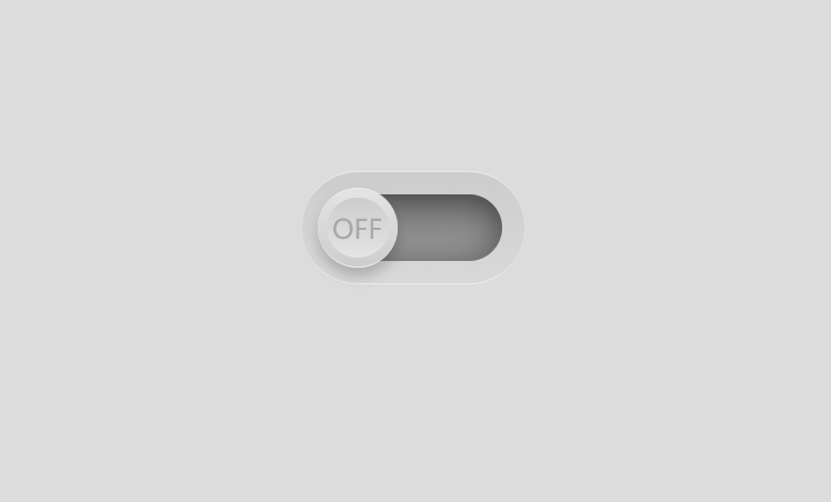
最外层 checkbox, 是按钮的整体, inner 是ON下绿色框所占的区域, toggle 是能点击的 ON 和 OFF 区域.
1.2 css 代码解析设置 body 字体和背景色
body{
  margin: 0;
  padding: 0;
  font-family: sans-serif;
  background: #dcdcdc;
}
设置按钮的背景色, 位置, 圆形边框, 上下边框颜色和厚度
.checkbox{
  position: absolute;
  top: 50%;
  left: 50%;
  transform: translate(-50%, -50%);


  border-radius: 25px;
  background: linear-gradient(0deg, #d8d8d8, #cccccc);
  border-top: 0.02em solid #ececec;
  border-bottom: 0.02em solid #ececec;
}
设置 绿色底色区域 的上下左右位置, 以此确定宽度和高度, 注意,这里没设宽度和高度, 默认是 auto
设置背景, 圆形边框, 阴影
.checkbox .inner{
  position: absolute;
  /* 因为没设宽和高, 所以可以这样 */
  top: 10px;
  left: 10px;
  right: 10px;
  bottom: 10px;
  background: linear-gradient(0deg, #a5a5a5, #717171);
  border-radius: 20px;
  box-shadow: inset 0 0 15px rgba(0,0,0,.5);
}
设置 ON OFF 按钮大小, 位置, 颜色, 背景, 阴影, 顶部和底部边框样式, 设置按钮上的动画时间为 0.5s
.checkbox .inner .toggle{
  position: absolute;
  top: -3px;
  left: -3px;


  border-radius: 50%;
  background: linear-gradient(0deg, #ccc, #e4e4e4);
  box-shadow: 0 4px 6px rgba(0,0,0,.2);
  box-sizing: border-box;
  border-top: 0.04em solid #ececec;
  border-bottom: 0.01em solid #ececec;
  transition: 0.5s;
}
设置 OFF 的样式,, 由上下左右的定位确定 宽和高, 设置背景, 圆形边框,pne-height用来设置字体垂直居中
.checkbox .inner .toggle:before{
  content: "OFF";
  position: absolute;
  top: 4px;
  left: 4px;
  right: 4px;
  bottom: 4px;
  background: linear-gradient(0deg, #e4e4e4, #ccc);
  border-radius: 50%;
  text-align: center;
  font-size: 10px;
  line-
  color: #a9a9a9;
}
设置 点击后按钮的字体, ON, 之所有没有写其他属性, 是因为其他属性都继承checkbox .inner .toggle:before
.checkbox .inner.active .toggle:before{
  content: "ON";
  color: #00d22d;
}
当按钮被点击, 滑块右移, 并且更改背景色, 更改时间为 0.5s
.checkbox .inner.active .toggle{
  left: 47px;
}
.checkbox .inner.active{
  background: linear-gradient(0deg, #00d22d, #158a00);
}
1.3 javascript 代码解析
首先获取到 inner 和 toggle, 一个背景色框, 一个圆形按钮
给按钮 toggle 注册点击事件, 点击 ON OFF 按钮才有效
当 inner 处于 active, 也就是 inner 元素包含 active 类, 那就移除, 如果不包含, 那就添加, 反正做一个相反的操作
当 inner 处于 active, toggle 会右移, inner 背景色会变换, 在 css中 设置
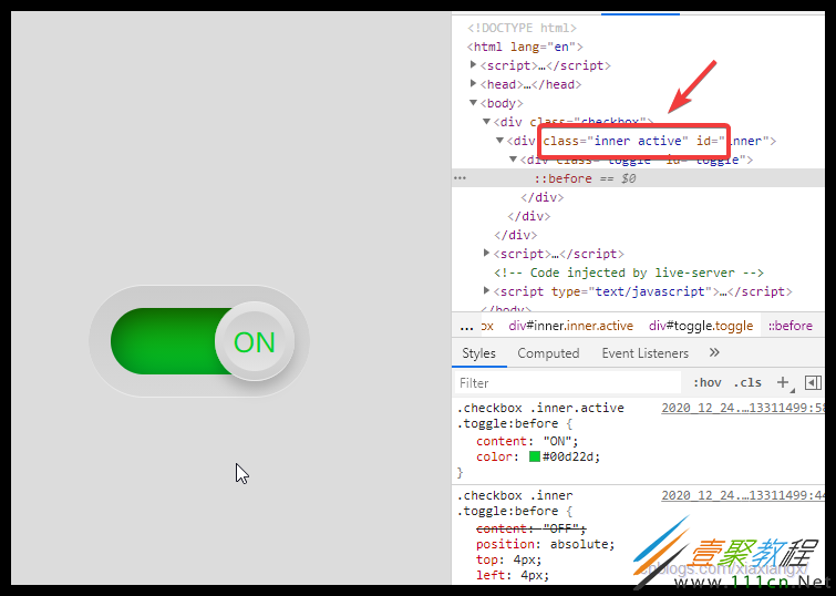
大功告成, 过程如下图

2. 源码
2.1 html 源码
Title
2.2 css 源码
body{
  margin: 0;
  padding: 0;
  font-family: sans-serif;
  background: #dcdcdc;
}
.checkbox{
  position: absolute;
  top: 50%;
  left: 50%;
  transform: translate(-50%, -50%);


  border-radius: 25px;
  background: linear-gradient(0deg, #d8d8d8, #cccccc);
  border-top: 0.02em solid #ececec;
  border-bottom: 0.02em solid #ececec;
}
.checkbox .inner{
  position: absolute;
  /* 因为没设宽和高, 所以可以这样 */
  top: 10px;
  left: 10px;
  right: 10px;
  bottom: 10px;
  background: linear-gradient(0deg, #a5a5a5, #717171);
  border-radius: 20px;
  box-shadow: inset 0 0 15px rgba(0,0,0,.5);
}
.checkbox .inner .toggle{
  position: absolute;
  top: -3px;
  left: -3px;


  border-radius: 50%;
  background: linear-gradient(0deg, #ccc, #e4e4e4);
  box-shadow: 0 4px 6px rgba(0,0,0,.2);
  box-sizing: border-box;
  border-top: 0.04em solid #ececec;
  border-bottom: 0.01em solid #ececec;
  transition: 0.5s;
}
.checkbox .inner .toggle:before{
  content: "OFF";
  position: absolute;
  top: 4px;
  left: 4px;
  right: 4px;
  bottom: 4px;
  background: linear-gradient(0deg, #e4e4e4, #ccc);
  border-radius: 50%;
  text-align: center;
  font-size: 10px;
  line-
  color: #a9a9a9;
}
.checkbox .inner.active .toggle:before{
  content: "ON";
  color: #00d22d;
}
.checkbox .inner.active .toggle{
  left: 47px;
}
.checkbox .inner.active{
  background: linear-gradient(0deg, #00d22d, #158a00);
}