html+css实现响应式卡片悬停效果代码示例
本篇文章小编给大家分享一下html+css实现响应式卡片悬停效果代码示例,文章代码介绍的很详细,小编觉得挺不错的,现在分享给大家供大家参考,有需要的小伙伴们可以来看看。
效果:
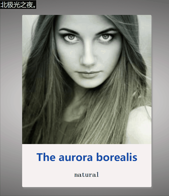
卡片悬停,响应式卡片,简约效果。
实现:
1. 定义标签,.kapian为最底层盒子,然后两个子盒子一个放图片,一个放文本:

The aurora borealis
natural
Aurora Borealis is a colorful luminous phenomenon that appears over the high magnetic latitude region of the planet's North Pole. I love the aurora borealis. It's so beautiful.
2.先定义底层盒子的css基本样式,长宽等,就不详细说明了:
 .kapian{
            position: relative;


            border-radius: 3px;
            background-color: #fff;
            box-shadow: 2px 3px 3px rgb(139, 138, 138);
            overflow: hidden;
            cursor: pointer;
            transition: all 0.3s;
        }
        .kapian:hover{
            box-shadow: 2px 3px 10px rgb(36, 35, 35);
        }
:hover鼠标经过后盒子阴影变化。
transition: all 0.3s;过渡效果,阴影在0.3s内慢慢变化
3. 图片的基本样式,采用绝对定位:
.tu{
            position: absolute;
            top: 0;
            left: 0;
            width: 100%;

            overflow: hidden;

        }
        .tu img{
            width: 100%;
            height: 100%;
            transition: all 0.5s;
        }
        .kapian:hover .tu img{
            transform: scale(1.2);
            filter: blur(1px);
        }
:hover鼠标经过后图片变大,而且变模糊;
transform: scale(1.2);图片变大为1.2倍;
filter: blur(1px);图片变模糊;
4 .定义装文本这个盒子的基本样式,采用绝对定位:
.wenben{
            position: absolute;
            bottom: -200px;
            width: 100%;

            background-color: rgb(247, 242, 242);
            transition: 0.5s;
        }
        .kapian:hover .wenben{
            bottom: 0px;
        }
:hover鼠标经过后文本框绝对定位的bottom发生改变,使得呈现文本框向上展开的效果;
5 .文本框里字符的样式:
.wenben h2{
            color: rgb(21, 74, 172);
            line-
            text-align: center;

        }
        .wenben p{
            padding: 0 30px;
            font-family: 'fangsong';
            font-size: 16px;
            font-weight: bold;
            line-
            text-align: center;
        }
完整代码:
The aurora borealis
natural
Aurora Borealis is a colorful luminous phenomenon that appears over the high magnetic latitude region of the planet's North Pole. I love the aurora borealis. It's so beautiful.
相关文章
-
《GigaBash》的《GigaBash – Ultraman Zero》DLC带来两位新角色:激荡竞争火花
游戏攻略 2026-07-22
-
“没有班纳,只有浩克”:《Spider-Man: Brand New Day》最终预告片发布:包含部分新镜头
游戏攻略 2026-07-22
-
The Terminator:Makinarium 的顶级道具师们是怎样让 T-800 的标志性部分重获新生的
游戏攻略 2026-07-22
-
The Blood of Dawnwalker:全新实机演示公开 揭秘诡谲新生物
游戏攻略 2026-07-22
-
迪士尼裁员波及数百名员工:据称皮克斯裁员部分因 天空跳跃者 表现不佳所致
游戏攻略 2026-07-22
-
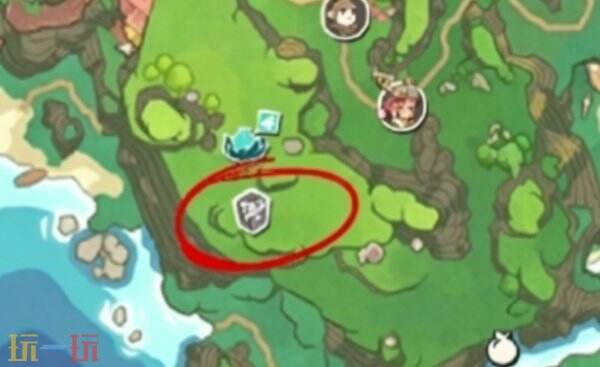
洛克王国世界月兔暗港魔力之源位置 洛克王国世界月兔暗港魔力之源怎么获得
游戏攻略 2026-07-22