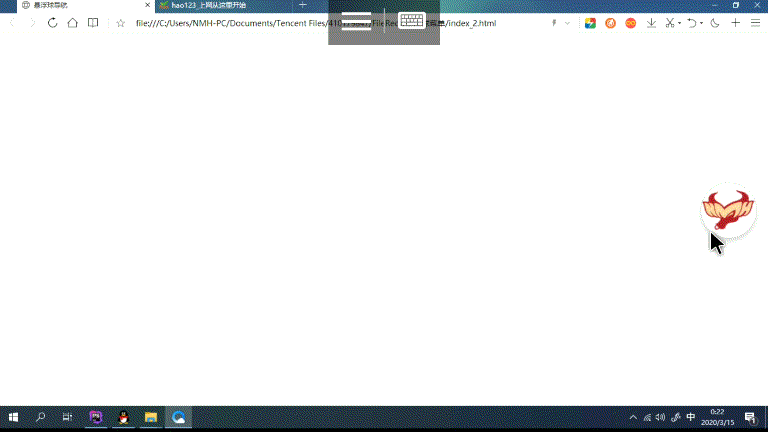
html滑动仿悬浮球菜单效果如何实现 html滑动仿悬浮球菜单效果实现代码
作者:袖梨
2022-06-25
html滑动仿悬浮球菜单效果如何实现?本篇文章小编给大家分享一下html滑动仿悬浮球菜单效果实现代码,文章代码介绍的很详细,小编觉得挺不错的,现在分享给大家供大家参考,有需要的小伙伴们可以来看看。
css样式
html,body{
	width: 100%;
	height: 100%;
	margin: 0;padding: 0;
}

/*导航图标*/
.NMH-g-navicon{
	position: fixed;
	top: 40%;
	right: 020px;


}
.NMH-g-navicon.Jnmh-onleft{
	right: auto;
	left: 020px;
}
/*导航图标logo按钮*/
.NMH-g-navicon .Jnmh-btnlogo{
	position: absolute;
	display: block;


	top: 50%;
	right: 0;
	margin-top: -50px;
	border: 0;
	background: url(img/icon_128.png) no-repeat center center;
    background-size: 95% 95%;
    border: 1px solid rgba(0, 0, 0, 0.1);
    box-shadow: rgba(0, 0, 0, 0.12) 0px 6px 10px 0px;
	outline: none;
	border-radius: 50%;
	z-index: 1;
}
.NMH-g-navicon .Jnmh-btnlogohover{
	position: absolute;
	display: block;


	top: 50%;
	right: 0;
	margin: 0;padding: 0;
	margin-top: -50px;
	border: 0;
	overflow: hidden;
	/*background-color: red;*/
}

/*导航图标logo按钮-鼠标经过*/
.NMH-g-navicon.Jnmh-open .Jnmh-btnlogohover{
	margin-top: -150px;


	border-radius: 150px 0 0 150px;
}
.NMH-g-navicon.Jnmh-onleft .Jnmh-btnlogohover{
	left: 0;
	right: auto;
	border-radius: 0 150px 150px 0;
}
/*导航图标菜单子容器*/
.NMH-g-navicon .Jnmh-m-submenu{
	position: absolute;
	background-color: transparent;
	list-style: none;
	top: -020px;
	bottom: -020px;
	left: -020px;
	right: -020px;
	margin: 0;
	padding: 0;
}

.NMH-g-navicon .Jnmh-m-submenu .Jnmh-subli{
	position: absolute;
	width: 100%;height: 100%;
	transform: rotate(0deg);
    -webkit-transform: rotate(0deg);
    transition: all 0.8s ease-in-out;
}

.Jnmh-m-submenu .Jnmh-subdl{
	position: absolute;
    left: 50%;
    bottom: 100%;
    width: 0;
    height: 0;
    line-
    margin-left: 0;
    background: #fff;
    border-radius: 50%;
    text-align: center;
    font-size: 1px;
    overflow: hidden;
    cursor: pointer;
    box-shadow: none;
    transition: all 0.8s ease-in-out, color 0.1s, background 0.1s;
}
/*导航图标-展开菜单时*/
.NMH-g-navicon.Jnmh-open .Jnmh-m-submenu .Jnmh-subdl{


    line-
    margin-left: -40px;
    box-shadow: 0 3px 3px rgba(0, 0, 0, 0.1);
    font-size: 14px;
}
/*导航图标-三级菜单容器*/
.NMH-g-navicon.Jnmh-open .Jnmh-m-submenu .Jnmh-subdd{
	position: absolute;
	line-height: normal;
}
html代码
javascript代码
相关文章
-
WAIC 2026 特别对话:当算力开始算账:谈 Token 经济学重塑芯片:拆解 AI 资本开支向上游转移
游戏攻略 2026-07-22
-
AdCopy.ai-AdCopy.ai是一家基于人工智能的数字广告平台的网站
游戏攻略 2026-07-22
-
Markprompt-Markprompt是一个生成GPT-4 prompts的工具
游戏攻略 2026-07-22
-
智能体手机热闹登场 WAIC:最难的一关还在底层
游戏攻略 2026-07-22
-
吉利银河TT Ultra开启预售 800V平台加持 3.8秒破百+6C超充
游戏攻略 2026-07-22
-
面积仅46mm²:xMEMS推出全球最小主动式微型风扇XMC-1200,专为AR、XR智能眼镜设计
游戏攻略 2026-07-22