CSS3如何实现侧滑菜单 CSS3实现侧滑菜单代码示例
作者:袖梨
2022-11-14
YPE html>
CSS3如何实现侧滑菜单?本篇文章小编给大家分享一下CSS3实现侧滑菜单代码示例,文章代码介绍的很详细,小编觉得挺不错的,现在分享给大家供大家参考,有需要的小伙伴们可以来看看。
实现效果:
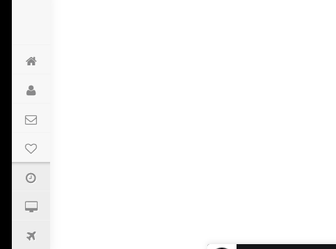
实现代码:
Side Menu
CSS3
body
{
  margin:0px;
  padding:0px;
	font-family: "Open Sans", arial;
	background:url('https://static.tu*mb**lr.com/94eb957a00fd03c0c2f7d26decd71578/u1rhacw/osAmyyh1q/tumblr_static_tumblr_static_gaussian_blur_gradient_desktop_1680x943_wallpaper-393751.jpg');
	color:#fff;
	font-weight:300;

}


@import url(//netdna.bootstrapcdn.com/font-awesome/4.0.3/css/font-awesome.css);
}
@import url(https://fonts.g*o*ogle*apis.com/css?family=Titillium+Web:300);

.logo{

}

.settings {


  float:left;
  background:url( https://s3.p*o*stim*g.org/bqfooag4z/startific.jpg);
  background-repeat:no-repeat;

  margin:0px;
 text-align: center;
font-size:20px;
font-family: 'Strait', sans-serif;

}


/* ScrolBar  */
.scrollbar
{

height: 90%;
width: 100%;
overflow-y: hidden;
overflow-x: hidden;
}

.scrollbar:hover
{

height: 90%;
width: 100%;
overflow-y: scroll;
overflow-x: hidden;
}

/* Scrollbar Style */


#style-1::-webkit-scrollbar-track
{
border-radius: 2px;
}

#style-1::-webkit-scrollbar
{

background-color: #F7F7F7;
}

#style-1::-webkit-scrollbar-thumb
{
border-radius: 10px;
-webkit-box-shadow: inset 0 0 6px rgba(0,0,0,.3);
background-color: #BFBFBF;
}
/* Scrollbar End */


.fa-lg {
font-size: 1em;

}
.fa {
position: relative;
display: table-cell;


text-align: center;
top:12px;
font-size:20px;

}


.main-menu:hover, nav.main-menu.expanded {

overflow:hidden;
opacity:1;

}

.main-menu {
background:#F7F7F7;
position:absolute;
top:0;
bottom:0;
height:100%;
left:0;

overflow:hidden;
-webkit-transition:width .2s linear;
transition:width .2s linear;
-webkit-transform:translateZ(0) scale(1,1);
box-shadow: 1px 0 15px rgba(0, 0, 0, 0.07);
  opacity:1;
}

.main-menu>ul {
margin:7px 0;

}

.main-menu li {
position:relative;
display:block;


}

.main-menu li>a {
position:relative;

display:table;
border-collapse:collapse;
border-spacing:0;
color:#8a8a8a;
font-size: 13px;
text-decoration:none;
-webkit-transform:translateZ(0) scale(1,1);
-webkit-transition:all .14s linear;
transition:all .14s linear;
font-family: 'Strait', sans-serif;
border-top:1px solid #f2f2f2;

text-shadow: 1px 1px 1px  #fff;
}


.main-menu .nav-icon {

position:relative;
display:table-cell;


text-align:center;
vertical-align:middle;
font-size:18px;

}

.main-menu .nav-text  {

position:relative;
display:table-cell;
vertical-align:middle;

font-family: 'Titillium Web', sans-serif;
}

.main-menu .share {
}


.main-menu .fb-like {

left: 180px;
position:absolute;
top: 15px;
}

.main-menu>ul.logout {
position:absolute;
left:0;
bottom:0;

}

.no-touch .scrollable.hover {
overflow-y:hidden;

}

.no-touch .scrollable.hover:hover {
overflow-y:auto;
overflow:visible;

}


/* Logo Hover Property */


.settings:hover, settings:focus {
  background:url( https://s17.po***stimg.org/74cl7s05b/logo_hover.jpg);
  -webkit-transition: all 0.2s ease-in-out, width 0, height 0, top 0, left 0;
-moz-transition: all 0.2s ease-in-out, width 0, height 0, top 0, left 0;
-o-transition: all 0.2s ease-in-out, width 0, height 0, top 0, left 0;
transition: all 0.2s ease-in-out, width 0, height 0, top 0, left 0;
}

.settings:active, settings:focus {
  background:url( https://s3.p*o*stim*g.org/bqfooag4z/startific.jpg);
  -webkit-transition: all 0.1s ease-in-out, width 0, height 0, top 0, left 0;
-moz-transition: all 0.1s ease-in-out, width 0, height 0, top 0, left 0;
-o-transition: all 0.1s ease-in-out, width 0, height 0, top 0, left 0;
transition: all 0.1s ease-in-out, width 0, height 0, top 0, left 0;
}


a:hover,a:focus {
text-decoration:none;
border-left:0px solid #F7F7F7;


}

nav {
-webkit-user-select:none;
-moz-user-select:none;
-ms-user-select:none;
-o-user-select:none;
user-select:none;

}

nav ul,nav li {
outline:0;
margin:0;
padding:0;
text-transform: uppercase;
}


/* Darker element side menu Start*/


.darkerli
{
background-color:#ededed;
text-transform:capitalize;
}

.darkerlishadow
{
background-color:#ededed;
text-transform:capitalize;
-webkit-box-shadow: inset 0px 5px 5px -4px rgba(50, 50, 50, 0.55);
-moz-box-shadow:    inset 0px 5px 5px -4px rgba(50, 50, 50, 0.55);
box-shadow:         inset 0px 5px 5px -4px rgba(50, 50, 50, 0.55);
}


.darkerlishadowdown
{
background-color:#ededed;
text-transform:capitalize;
-webkit-box-shadow: inset 0px -4px 5px -4px rgba(50, 50, 50, 0.55);
-moz-box-shadow:    inset 0px -4px 5px -4px rgba(50, 50, 50, 0.55);
box-shadow:         inset 0px -4px 5px -4px rgba(50, 50, 50, 0.55);
}

/* Darker element side menu End*/


.main-menu li:hover>a,nav.main-menu li.active>a,.dropdown-menu>li>a:hover,.dropdown-menu>li>a:focus,.dropdown-menu>.active>a,.dropdown-menu>.active>a:hover,.dropdown-menu>.active>a:focus,.no-touch .dashboard-page nav.dashboard-menu ul li:hover a,.dashboard-page nav.dashboard-menu ul li.active a {
color:#fff;
background-color:#00bbbb;
text-shadow: 0px 0px 0px;
}
.area {
float: left;
background: #e2e2e2;
width: 100%;
height: 100%;
}
@font-face {
  font-family: 'Titillium Web';
  font-style: normal;
  font-weight: 300;
  src: local('Titillium WebLight'), local('TitilliumWeb-Light'), url(http://themes.g**oogleus*ercontent.com/static/fonts/titilliumweb/v2/anMUvcNT0H1YN4FII8wpr24bNCNEoFTpS2BTjF6FB5E.woff) format('woff');
}