html css3不拉伸图片显示效果代码实例
作者:袖梨
2022-06-25
本篇文章小编给大家分享一下html css3不拉伸图片显示效果代码实例,文章代码介绍的很详细,小编觉得挺不错的,现在分享给大家供大家参考,有需要的小伙伴们可以来看看。
1.利用transform属性不拉伸显示图片,(路径问题需要按需求修改);
html:
CSS:
#surface-div1{
    position: relative;


    float: left;
    margin-top: -34px;
    margin-left: 122px;
    cursor: pointer;
    background: url(../../../static/img/addheadpic.jpg)center center no-repeat;
    text-align: center;
    border: 1px solid #CCCCCC;
    border-radius:6px;
    overflow: hidden;
}
#surface-div1 img{
    position: absolute;
    width: 100%;
    top: 50%;
    left: 0;
    transform: translateY(-50%) scale(1);
    border:none;
    border-radius: 6px;display:table-cell
}


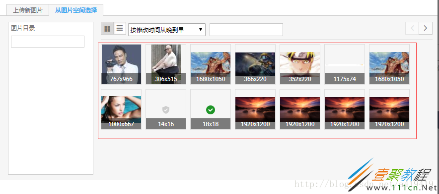
最终效果如上图的左边。
2.参考淘宝的,利用display:table-cell和文字大小控制居中
html:
css:
#surface-div{
    position: relative;


    float: left;
    margin-top: -34px;
    margin-left: 122px;
    cursor: pointer;
    background: url(../../../static/img/addheadpic.jpg)center center no-repeat;
    text-align: center;
    border: 1px solid #CCCCCC;
    border-radius:6px;
    overflow: hidden;
}
.sur-div{
    display: table-cell;
    text-align: center;
    vertical-align: middle;
    font-size: 12px;


    overflow: hidden;
}
#surface-div img{
    max-height: 100%;
    max-width: 100%;
    vertical-align: middle;
    border: 0;
}

效果如上图中的左边部分,重点是需要外面的div是正方形。
淘宝的是这样的: