使用resize实现图片切换预览功能代码示例
作者:袖梨
2022-06-25
本篇文章小编给大家分享一下使用resize实现图片切换预览功能代码示例,文章代码介绍的很详细,小编觉得挺不错的,现在分享给大家供大家参考,有需要的小伙伴们可以来看看。
关键点
CSS resize 属性允许你控制一个元素的可调整大小性
配合 resize 实现子元素的动态宽度
HTML:
css;">
SCSS:
html {
    background: #ddd;
    height: 100%;
    width: 100%;
}
.picA {
    background-image: url(https://z3.**a*x1x.com/2021/08/17/fhJdpQ.png);
    background-size: cover;


    border: 5px solid #f0e5ab;
    border-radius: 3px;
    box-shadow: 0 0 1px #999, -2px 2px 3px rgba(0, 0, 0, 0.2);
    padding: 0;
    margin: 1rem auto;
    position: relative;
    overflow: hidden;
}
.picB {
    background-image: url(https://z3.a**x1*x.com/2021/08/17/fhJUfg.png);
    background-size: cover;

    position: absolute;
    top: 0;
    left: 0;
    min-width: 0;
    max-
    box-sizing: border-box;
}
.picB:before {
    content: "↔";
    position: absolute;
    background: rgba(0, 0, 0, 0.5);
    font-size: 16px;
    color: white;
    top: 0;
    right: 0;
    height: 100%;
    line-
}
.resizeElement {
    resize: horizontal;
    overflow: scroll;
    opacity: 0;
    position: relative;
    top: 50%;
    left: 0px;

    max-
    min-
    width: 0;
    cursor: move;
    transform: scaleY(35);
    transform-origin: center center;
    animation: delta 5s normal ease-in-out 1s;
}
@keyframes delta {
    30% {
        width: 0;
    }
    60% {

    }
    100% {
        width: 0;
    }
}
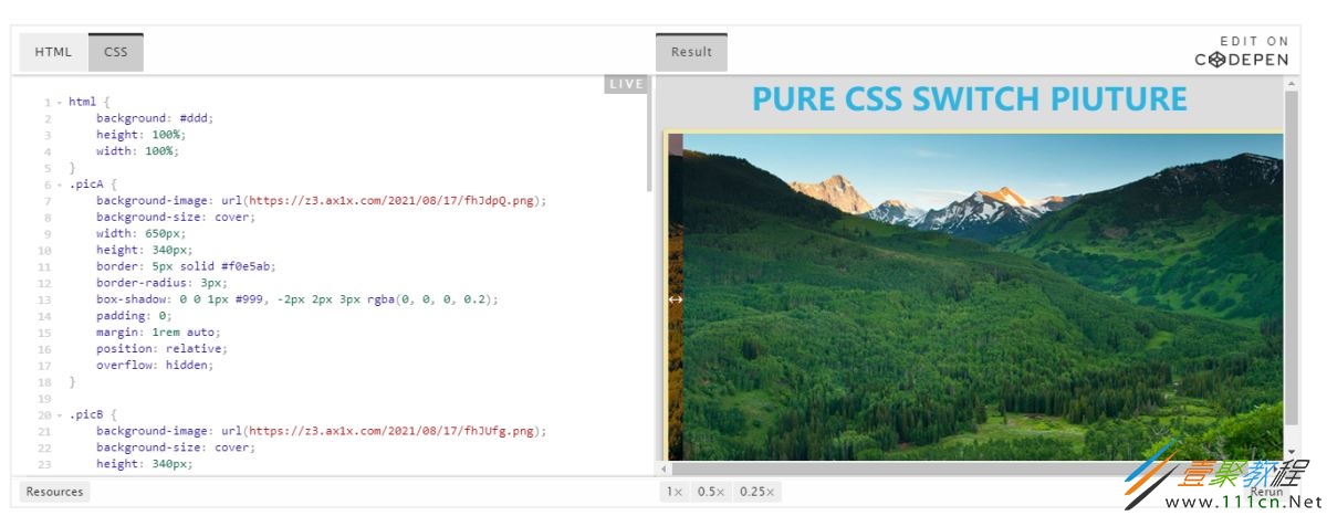
效果如下: