html+css实现图片扫描仪特效
作者:袖梨
2025-07-17
本文主要介绍了html css 图片扫描仪,分享给大家,具体如下:
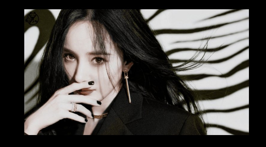
效果:
这样,有抖动的:

无抖动的:
实现:
1.定义一个盒子:
<body> <div class="tu"></div></body>
2.基本样式,长宽背景图等等~
.tu{ width: 500px; height: 300px; background-image: url(8.jpg); background-size: 100% auto; background-repeat: no-repeat; position: relative; overflow: hidden; cursor: pointer; }cursor: pointer;鼠标经过盒子样式为小手
3.用伪类元素做扫描线,基本样式:
.tu::after{ content: ''; position: absolute; top: 0; left: 0; width: 500px; height: 35px; background-image: url(8.jpg); background-size: 100% auto; background-repeat: no-repeat; filter: sepia(100%); opacity: 0; }filter: sepia(100%); 图片发黄。filter: invert(100%); 像X光底片。
4.实现扫描:
.tu:hover::after{ opacity: 1; animation: move 1.8s linear infinite; } @keyframes move{ 0%{ top: 0; background-position: 6px 0px; } 20%{ top: 60px; background-position: -6px -60px; } 40%{ top: 120px; background-position: 6px -120px; } 60%{ top: 180px; background-position: -6px -180px; } 80%{ top: 240px; background-position: 6px -240px; } 100%{ top: 300px; background-position: -6px -300px; } }让background-position的y轴位移刚好等于top的距离,然后x轴为0的话就不抖,有数值就会抖动。
完整代码:
<!DOCTYPE html><html lang="zh-CN"><head> <meta charset="UTF-8"> <meta name="viewport" content="width=device-width, initial-scale=1.0"> <title>Document</title> <style> *{ margin: 0; padding: 0; box-sizing: border-box; } body{ height: 100vh; display: flex; justify-content: center; align-items: center; background-color: rgb(0, 0, 0); } .tu{ width: 500px; height: 300px; background-image: url(8.jpg); background-size: 100% auto; background-repeat: no-repeat; position: relative; overflow: hidden; cursor: pointer; } .tu::after{ content: ''; position: absolute; top: 0; left: 0; width: 500px; height: 20px; background-image: url(8.jpg); background-size: 100% auto; background-repeat: no-repeat; filter: invert(100%); opacity: 0; } .tu:hover::after{ opacity: 1; animation: move 1.8s linear infinite; } @keyframes move{ 0%{ top: 0; background-position: 6px 0px; } 20%{ top: 60px; background-position: -6px -60px; } 40%{ top: 120px; background-position: 6px -120px; } 60%{ top: 180px; background-position: -6px -180px; } 80%{ top: 240px; background-position: 6px -240px; } 100%{ top: 300px; background-position: -6px -300px; } } </style></head><body> <div class="tu"></div></body></html>总结:
这是网上看到一外国博主的创意,然后自己也弄了一个,虽然效果是比较简单的,但也是挺好玩的~
到此这篇关于html+css实现图片扫描仪特效 的文章就介绍到这了,更多相关html+css图片扫描仪 内容请搜索一聚教程网以前的文章或继续浏览下面的相关文章,希望大家以后多多支持一聚教程网!