animation
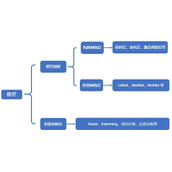
动画属性
@keyframes:
规定动画
源代码
animation-delay:
规定动画何时开始
源代码
animation-iteration-count:
规定动画次数
源代码
animation-direction:
规定下次动画逆向
源代码
<
textarea readonly="readonly" class="tip" style="border-bottom:1px solid #000;"><div class="cont1 conns">animation-delay:规定动画何时开始 </div>
body{background-color: #000;}
.cont{
border: 1px solid #fff;
float: left;
width: 250px;
height: 250px;
position: relative;
box-sizing:border-box;
}
.conns{white-space: initial;}
.cont a{
position: absolute;
top:50px;
left: 5px;
color: #e3e3e3;
word-wrap: break-word;
display: block;
width: 5px;
text-decoration: none;
}
.cont1{
width: 100px;
height:80px;
margin:0 auto;
background-color: #999;
color: #fff;
padding: 10px;
position:relative;
overflow: hidden;
animation:myfrom 5s infinite;
-webkit-animation:myfrom 5s infinite;
}
@-webkit-keyframes myfrom{
from {top:0;}
to {top:150px;}
}
@keyframes myfrom{
from {top:0;}
to {top:150px;}
}
<div class="cont2 conns">animation 动画属性,@keyframes:规定动画 </div>
.cont2{
width: 80px;
height:80px;
margin:0 auto;
background-color: #999;
color: #fff;
padding: 10px;
position:relative;
overflow: hidden;
animation:myfrom 5s infinite;
-webkit-animation:myfrom 5s infinite;
animation-delay:2s;
-webkit-animation-delay:2s;
}
其余css同第一个
<div class="cont3 conns">animation-iteration-count: 规定动画次数</div>
.cont3{
width: 80px;
height:80px;
margin:0 auto;
background-color: #999;
color: #fff;
padding: 10px;
position:relative;
overflow: hidden;
animation:myfrom 5s infinite;
-webkit-animation:myfrom 5s infinite;
animation-iteration-count:2;
-webkit-animation-iteration-count:2;
}
其余css同第一个
<div class="cont4 conns">animation-direction: 规定下次动画逆向</div>
.cont4{
width: 80px;
height:80px;
margin:0 auto;
background-color: #999;
color: #fff;
padding: 10px;
position:relative;
overflow: hidden;
animation:myfrom 5s infinite;
-webkit-animation:myfrom 5s infinite;
animation-direction:alternate;
-webkit-animation-direction:alternate;}
其余css同第一个
<div class="cont5 conns"> </div>
.cont5{
margin: 6em auto;
font-size: 10px;
position: relative;
border: 1.1em solid rgba(255, 255, 255, 0.2);
border-left: 1.1em solid #ffffff;
-webkit-animation: cont5 1.1s infinite linear;
animation: cont5 1.1s infinite linear;
}
.cont5,.cont5:after{
border-radius: 50%;
width: 10em;
height: 10em;
}
@keyframes cont5{
from {-webkit-transform: rotate(0deg);transform: rotate(0deg);}
to {-webkit-transform: rotate(360deg);transform: rotate(360deg);}
}
@-webkit-keyframes cont5{
from {-webkit-transform: rotate(0deg);transform: rotate(0deg);}
to {-webkit-transform: rotate(360deg);transform: rotate(360deg);}
}
<div class="cont6 conns"> </div>
body{background-color: #000;}
.cont6{
height: 120px;
width: 120px;
margin: 50px auto;
border-radius: 50%;
background:linear-gradient(left,#fff,#000);
background:-webkit-linear-gradient(left,#fff 10%,rgba(255,255,255,0) 40%);
background:-moz-linear-gradient(left,#fff 10%,rgba(255,255,255,0) 40%);
background:-o-linear-gradient(left,#fff 10%,rgba(255,255,255,0) 40%);
background:-ms-linear-gradient(left,#fff 10%,rgba(255,255,255,0) 40%);
position: relative;
-webkit-animation: cont6 1.1s infinite linear;
animation: cont6 1.1s infinite linear;
}
.cont6:before{
height: 50%;
width: 50%;
background:#fff;
content: '';
display: block;
border-radius:100% 0 0 0;
position: absolute;
top:0;
left: 0;
}
.cont6:after{
height: 75%;
width: 75%;
margin: auto;
background:#000;
content:'';
display: block;
border-radius:50%;
position: absolute;
top:0;left: 0;
right: 0;
bottom: 0;
}
@keyframes cont6{
from {-webkit-transform: rotate(0deg);transform: rotate(0deg);}
to {-webkit-transform: rotate(360deg);transform: rotate(360deg);}
}
@-webkit-keyframes cont6{
from {-webkit-transform: rotate(0deg);transform: rotate(0deg);}
to {-webkit-transform: rotate(360deg);transform: rotate(360deg);}
}
<div class="cont7 conns"> </div>
body{background-color: #000;}
.cont7,.cont7:before,.cont7:after{
height: 25px;
width: 25px;
border-radius: 50%;
animation:cont7 1.8s infinite ease-in-out;
-webkit-animation:cont7 1.8s infinite ease-in-out;
}
.cont7{
position: relative;
top:0;
margin: 80px auto;
animation-delay:0.2s;
-webkit-animation-delay:0.2s;
}
.cont7:before{
content: '';
position: absolute;
left: -50px;
}
.cont7:after{
content: '';
position: absolute;
left: 50px;
animation-delay:0.4s;
-webkit-animation-delay:0.4s;
}
@keyframes cont7{
0%,
80%,
100% {box-shadow: 0 2.5em 0 -1.3em #ffffff; }
40% {box-shadow: 0 2.5em 0 0 #FFF;}
}
@-webkit-keyframes cont7{
0%,
80%,
100% {box-shadow: 0 2.5em 0 -1.3em #ffffff;}
40% {box-shadow: 0 2.5em 0 0 #FFF;}
}
<div class="cont8 conns"> </div>
body{background-color: #000;}
.cont8{
width: 96px;
height: 48px;
border-radius: 50%;
border-bottom:50px solid #fff;
border-top:2px solid #fff;
border-left:2px solid #fff;
border-right:2px solid #fff;
position: relative;
top:0;
margin: 80px auto;
}
.cont8:before{
content: '';
position: absolute;
width: 12px;
height: 12px;
border-radius: 50%;
border: 18px solid #000;
top:21px;
background-color: #fff;
left: 0;
}
.cont8:after{
content: '';
position: absolute;
width: 12px;
height: 12px;
border-radius: 50%;
border: 18px solid #fff;
top:21px;
background-color: #000;
right: 0;
}