css3+jquery动画弹出层效果分享
作者:袖梨
2022-06-25
今天给大家分享一款基于css3和jquery实现的动画弹出层。这款弹出层初页面面一个显示弹出层按钮。单击该按钮时,弹出层以非常炫的动画形式出现。弹出层有关闭按钮,单击半闭按钮,弹出层关闭。效果图如下:

实现的代码。
html代码:
| 代码如下 | 复制代码 |
|
|
|
css3代码:
| 代码如下 | 复制代码 |
| @import url("http://daneden.gith***ub.io/animate.css/animate.min.css"); :root { width: 100%; height: 100%; } body { width: 100%; height: 100%; display: -webkit-flex; display: -ms-flexbox; display: flex; -webkit-align-items: center; -ms-flex-align: center; align-items: center; -webkit-justify-content: center; -ms-flex-pack: center; justify-content: center; overflow: hidden; background-color: #263238; } .papersheet { position: relative; overflow: hidden; text-align: center; -moz-box-sizing: border-box; box-sizing: border-box; -webkit-transition: all 200ms; transition: all 200ms; width: 100%; height: 100%; max-width: 50%; min-width: 50rem; max-height: 50%; min-height: 20rem; margin: 0 auto; display: -webkit-flex; display: -ms-flexbox; display: flex; -webkit-align-items: center; -ms-flex-align: center; align-items: center; -webkit-justify-content: center; -ms-flex-pack: center; justify-content: center; } .papersheet.opened { -webkit-transition: all 900ms; transition: all 900ms; box-shadow: 0px 5px 20px rgba(0, 0, 0, 0.5); } .papersheet__trigger { z-index: 1; display: inline-block; padding: 2rem; border-radius: 50%; position: absolute; background-color: transparent; top: 50%; left: 50%; -webkit-transform: translate(-50%, -50%); -ms-transform: translate(-50%, -50%); transform: translate(-50%, -50%); -webkit-transition: all 800ms cubic-bezier(0.19, 1, 0.22, 1); transition: all 800ms cubic-bezier(0.19, 1, 0.22, 1); cursor: pointer; } .opened .papersheet__trigger { background-color: #eceff1; top: 10%; } .papersheet__trigger:hover { box-shadow: 0px 5px 20px rgba(0, 0, 0, 0.5); } .papersheet__trigger:active:before { background-color: #d5d5d5; } .papersheet__trigger:before { content: ""; background-color: #eceff1; display: block; position: absolute; border-radius: 50%; top: 50%; left: 50%; bottom: 50%; right: 50%; width: 6rem; height: 6rem; z-index: 0; pointer-events: none; -webkit-transform: translate(-50%, -50%); -ms-transform: translate(-50%, -50%); transform: translate(-50%, -50%); -webkit-transition-delay: 2s; transition-delay: 2s; -webkit-transition: all 400ms cubic-bezier(0.165, 0.84, 0.44, 1); transition: all 400ms cubic-bezier(0.165, 0.84, 0.44, 1); } .opened .papersheet__trigger:before { width: 3000px; height: 3000px; -webkit-transition: all 2.5s cubic-bezier(0.165, 0.84, 0.44, 1); transition: all 2.5s cubic-bezier(0.165, 0.84, 0.44, 1); } .papersheet__trigger-icon { fill: #37474f; vertical-align: bottom; -webkit-transform: rotate(45deg); -ms-transform: rotate(45deg); transform: rotate(45deg); -webkit-transition: all 800ms cubic-bezier(0.19, 1, 0.22, 1); transition: all 800ms cubic-bezier(0.19, 1, 0.22, 1); -webkit-transition-delay: 50ms; transition-delay: 50ms; width: 1.8rem; height: 1.8rem; } .opened .papersheet__trigger-icon { -webkit-transform: rotate(-360deg); -ms-transform: rotate(-360deg); transform: rotate(-360deg); } .papersheet__face-item { border-radius: 50%; margin: 0 1.5rem; z-index: 1; height: 6rem; width: 6rem; display: none; overflow: hidden; } .papersheet__face-item:nth-child(2) { -webkit-animation-delay: 50ms; animation-delay: 50ms; } .papersheet__face-item:nth-child(3) { -webkit-animation-delay: 150ms; animation-delay: 150ms; } .papersheet__face-item:nth-child(4) { -webkit-animation-delay: 250ms; animation-delay: 250ms; } .papersheet__face-item img { max-width: 100%; } .opened .papersheet__face-item { -webkit-transform: translateX(60%); -ms-transform: translateX(60%); transform: translateX(60%); display: block; } |
|
相关文章
-
MiMo-V2.5 – 小米MiMo全模态Agent大模型系列:1M上下文
游戏攻略 2026-07-08
-
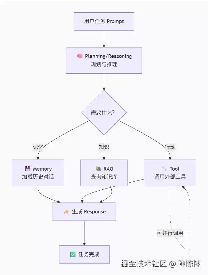
Agent开发完全指南:从LLM到智能体的蜕变之旅
游戏攻略 2026-07-08
-
从零构建读写锁:一个 TypeScript 并发控制的入门范例
游戏攻略 2026-07-08
-
全程使用Claude Code自动化部署Linux环境
游戏攻略 2026-07-08
-
Leanstral 1.5 – 由Mistral AI开发的Lean 4形式化证明与程序验证模型
游戏攻略 2026-07-08
-
Vidu S1 - 生数科技推出的实时交互视频生成和数字人模型
游戏攻略 2026-07-08